A.P.A.D.
New member
- Dec 2, 2010
- 949
- 0
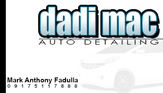
The logo is cool...website is kinda long.
Sent from my SCH-R970 using Tapatalk
it is long, but it is what it is. folks seem to make it through though
 rops:
rops:Follow along with the video below to see how to install our site as a web app on your home screen.
Note: This feature may not be available in some browsers.
The logo is cool...website is kinda long.
Sent from my SCH-R970 using Tapatalk
rops:I like that alot.....here, less does look good to me.
Sent from my SCH-R970 using Tapatalk


Went from this,
to this...
This is more of a general business tip than strictly a business card tip but here goes:
I've seen a few cards with email addresses like [email protected] or [email protected]. Get rid of these. Even if you don't have your own dedicated website you can get a personalised email address for yourself so you can have [email protected] or even [email protected]
It sounds and looks a whole lot more professional as well as being a subtle marketing tool. Also, this type of email hosting is dirt cheap now, anything from $2 upwards.
Now for business card design:
1. Always hire a professional - those websites with card builders are mostly rubbish
2. Keep it simple(ish) but not boring - self explanatory
3. A business card is like a powerpoint presentation. There must only be a very small number of well chosen words which prompt questions from the person whom you give the card to. The answers to any detailing question the potential customer has must come from you and not the card.
4. Easy on the colour scheme. Yes, the card with 11 different bold and bright colours will stand out in a pile of business cards but definitely not for the right reason. Use complimentary colours.
5. The card must have a purpose - a business card with the purpose of simply communicating your contact details is completely different from a business card whose purpose is to entice potential customers into contacting you. With a defined purpose there is less chance of the card becoming too cluttered.
6. Speaking of cluttered - this is a definite no-no. If your card looks like a spam advert most people will toss it the minute you're out of sight.
7. Avoid words like "guaranteed" "best" "satisfaction". These words sounds much like those late night infomercials selling (mostly) useless junk.
8. Check, double check, triple check and quadruple check before printing. Nothing looks more unprofessional than a) a business card with an error/typo or b) a hand written correction on a printed card (yes I've seen this). An error like this is even worse in a field like DETAILing where attention to detail is expected.
9. Don't use a border around your card. Someone in the printing industry told me that its a risk when cutting the card.
10. Align your card with any other marketing media you currently have. The theme must be consistent. For example, if your Facebook page and website have a certain colour scheme and logo then stick with it when designing your card too. This communicates a unified brand message.
11. Don't be afraid to experiment with textured stock, cutouts and other cool stuff. It will definitely give your card an edge. However, this will obviously raise the price of your cards but its most definitely worth it.
rops:Same with the front and back. Think I have the basics covered so far. Always room for improvement though.
I've seen several great card designs in this thread but this one reminded me of an important tip: on promotional items such as this, get the grammar and spelling correct. Always double check before having the card printed.
"YOUR GONNA LIKE THE WAY YOUR RIDE LOOKS, I GUARANTEE IT"
This should not pass initial review before printing. I can forgive the use of "gonna" but not the misuse of your vs. you're.
To go one step more in the professional direction also use an email address set up to use your domain name instead of yahoo or Gmail. If you are paying for hosting this is free.
Don't get me wrong I'm no grammar Nazi and make mistakes with such things (including in my posts) but anything which is designed to impact 1st impressions and anything representing the business requires extra attention.