Excessive Detail
New member
- Apr 16, 2006
- 1,166
- 0
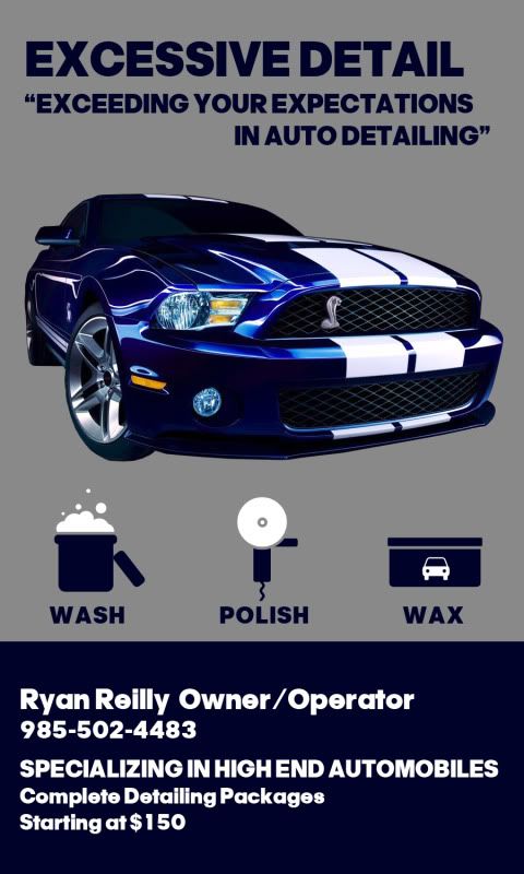
My cousin did it for me, he is a heck of a lot more creative than I am. May make a few changes hear and there, but for the most part the look im goin for. Tell me what you think.
Follow along with the video below to see how to install our site as a web app on your home screen.
Note: This feature may not be available in some browsers.
Looks pretty good to me and I like the vertical layout. Not sure I would want any pricing info on it though.
Looks pretty good to me and I like the vertical layout. Not sure I would want any pricing info on it though.
 ont set the bar too high, I think its best to under promise and over deliver
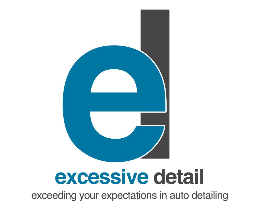
Well I wanted to post this after reading some of the replies and some of my own concerns over how the business card turned out, so I decided to rework the card. I originally designed it while both of us sat at a coffee shop and I pretty much created it in about an hour. Then after reading some of post, both my cousin and I felt it could use some more work. I took it as a challenge and started to think of how a Graphic Designer would approach it (what I earned my degree in from college). I approach it with intent on designing a logo and then mold any the business cards or any other flyers/brochures around the logo with the main focus being clean, simple, and professional looking. Hope you guys like it, my cousin did compared to the other design.
This is what I came up with:
Hopefully when he gets the card finalized and printed he will post some pictures up. I am also working on a brochure for him.

My cousin did it for me, he is a heck of a lot more creative than I am. May make a few changes hear and there, but for the most part the look im goin for. Tell me what you think.
I really like the wash polish wax pictures, nice touch!
I like the one with the car on it,
")