New logo. Would like some input.

Divine Details

New member
Joined
Jun 8, 2012
Messages
195
Reaction score
0
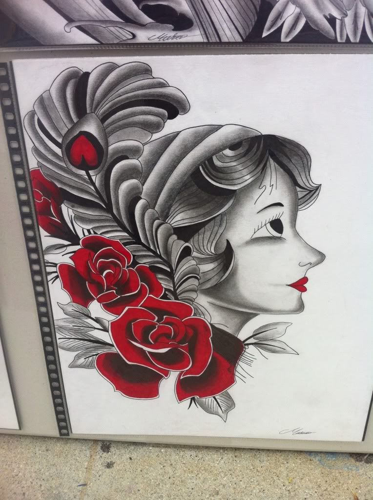
I'm in the process of getting a logo designed and would like opinions.
What colors would you use or would you leave it black and white?
Any other input welcome as well

6u6u8e8a.jpg


Chad @ divine details
 
i think the lettering is too small when compared to the overall size of the logo. and the two letters that stand out should typically be the first letters of each word so they are memorable. the S at the end of the word details has no significant value to the company name for advertising purposes.
 
Adding on to the previous post. I understand what you're doing with the letters and the wheels. Maybe up the letter size and shift Details to the end and use the D as your rear tire.
 
I saw this yesterday, but didn't say anything because of a the criticism I get.

IMO as a customer, it looks to plain and simple.

As an Artist however, if you want to keep that particular design, then you need more shading to make it look more realistic.

BDC24B90-40DB-4F24-BE0F-7E60F366EE4F-1140-0000016BA9813F6B_zps365ee477.jpg


(This is a tattoo design, not saying use this, just an example)

Also IMO add a tad bit of color to it.

I do like you wheels/tires design however!
 
Any color ideas


Chad @ divine details

-How about something with these colors...And:

-Move the "D" (and -etails) to the rear wheel-opening to correspond with the "D" (in divine) at the front wheel-opening

Divine_Details.jpg


-Leaves plenty of room for your contact information where ever you want.

Just a thought.

:)

Bob
 
I saw this yesterday, but didn't say anything because of a the criticism I get.

IMO as a customer, it looks to plain and simple.

As an Artist however, if you want to keep that particular design, then you need more shading to make it look more realistic.

BDC24B90-40DB-4F24-BE0F-7E60F366EE4F-1140-0000016BA9813F6B_zps365ee477.jpg


(This is a tattoo design, not saying use this, just an example)

Also IMO add a tad bit of color to it.

I do like you wheels/tires design however!

The tad bit of color will make it Pop!
 
-How about something with these colors...And:

-Move the "D" (and -etails) to the rear wheel-opening to correspond with the "D" (in divine) at the front wheel-opening

Divine_Details.jpg


-Leaves plenty of room for your contact information where ever you want.

Just a thought.

:)

Bob

Yes I like this one more, makes it look more uniform
 
I have made my own logos and helped and make some on here. I think your font should stay the same . Or if each word has a different font make it simaler. Car silhouettes are fine but over done . And yours has alot of detail . If you chose to use one make it with less detail . Aslo loss the wheel wells .

Sent from my SPH-L710 using AG Online
 
Definitely use the same font on each word, and overprint the car with the lettering disregarding the car itself...just let it be in the background. Like the previous poster said, lose the wheel wells and most of the car detail - it's distracting. Simplicity works best.
 
Waited too long to add this before. Googled Ferrari silhouette for the image, although I didn't get a Ferrari. You get the idea though.

5kg86o.png
 
Waited too long to add this before. Googled Ferrari silhouette for the image, although I didn't get a Ferrari. You get the idea though.

5kg86o.png

I like that good recommendation (concept). Orange is a very dynamic color.
 
Back
Top