Please comment on my website design

F88F556D-2229-457A-B172-448F73F03CDE-419-000000BCB5E87416_zps089dc304.jpg


AADB041C-86D9-4013-B543-5A24385EFFB7-419-000000BCBECE3218_zps0d5d6808.jpg


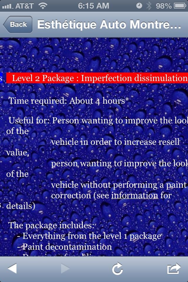
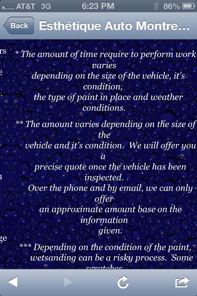
The blue bubbles under the white letters was hard for me to read.

At first I couldn't understand it (what language is the btw?)

I then realized if I scrolled to the right it was in English, then I understood it. (It took a lot of work for basic information a customer would be looking for IMO)

Maybe it's because I went to your site on my phone?

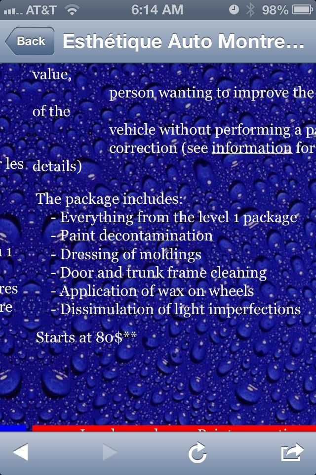
The package section was nice, it just seemed disorganized and didn't provide to much information. I like when they say paint correction is by quote only.

Just my opinion, maybe hire a web designer?

Overall at least you've taken your first steps and AGO is always very helpful!

Congratulations and Good Luck!
 
My feedback as a web developer;

1: Use separate pages for French and English

2: The text has hard
line breaks at
unusual
places which makes it hard
to read

3: I agree with hernandez.art13

4: Use a menu bar for the links at the top

5: Create a mobile-friendly version since you offer mobile detailing
 
I would also make a option where they can choose the language.
then change the background, keep it simple.
put your text more in blocks/ paragraphs, it's hard to read now.
and maybe about prices, 80 for 1 stage cleaning is pretty cheap,... how you will get around with that
 
My feedback as a web developer;

1: Use separate pages for French and English

2: The text has hard
line breaks at
unusual
places which makes it hard
to read

3: I agree with hernandez.art13

4: Use a menu bar for the links at the top

5: Create a mobile-friendly version since you offer mobile detailing

I agree with #1. If you know CSS, it can do wonders for you as far as toggling between language or just straight up have another page for the secondary language. Also, might want to get rid of the water beading background, the key rule when doing web dev is to keep the styling simple and not have too many things going on at once, most importantly easy to read. Try to keep your font consistent and not jump around to different font types.
 
I would just revise your website over again not bad just could use some tuch-up's, good try though through and through best of luck, the deta
 
F88F556D-2229-457A-B172-448F73F03CDE-419-000000BCB5E87416_zps089dc304.jpg


AADB041C-86D9-4013-B543-5A24385EFFB7-419-000000BCBECE3218_zps0d5d6808.jpg


The blue bubbles under the white letters was hard for me to read.

At first I couldn't understand it (what language is the btw?)

I then realized if I scrolled to the right it was in English, then I understood it. (It took a lot of work for basic information a customer would be looking for IMO)

Maybe it's because I went to your site on my phone?

The package section was nice, it just seemed disorganized and didn't provide to much information. I like when they say paint correction is by quote only.

Just my opinion, maybe hire a web designer?

Overall at least you've taken your first steps and AGO is always very helpful!

Congratulations and Good Luck!

Now that I am on my computer instead of my phone it's gonan be easier to answer ;)

I made the background darker, I have no problem to read it. Do you still have issues? I might simply remove it though. I just think it looks really plain with only text.

For the language, that is because you are most likelly in the US. Here in Canada, especially in Montréal, we are used to having both french and English side by side.

Not sure why it's not formating correctly on your phone. The site is 1024 pixels large, all recent phones should be able to handle that. Ah look at that. I just checked. On my galaxy S4 the formating is perfect. On my iPhone 3gs one section comes all screwed up and the rest is perfect. Now that I know that I will validate formating with both my phones in the future. Thanks.

Not too sure what you mean by disorganized... are you talking about the text formating? List of included items is pretty straightforward in my book. The detailed info about each aspect of detailing will be in the info section and I have not done that yet, this will take a while to do because I intend to go very technical with a lot of images.

As for paint correction by quote only, that's you. Here in Montréal everyone has a price on their website. So if I do that people will simply go somewhere else.

Thanks for the input.

Daniel
 
My feedback as a web developer;

1: Use separate pages for French and English

2: The text has hard
line breaks at
unusual
places which makes it hard
to read

3: I agree with hernandez.art13

4: Use a menu bar for the links at the top

5: Create a mobile-friendly version since you offer mobile detailing

-----

1. I could do that, the welcoming page would be pretty empty if I did. Maybe I can keep the index file bilangual and have the rest of the pages unilingual. What do you think?

2. Ya I noticed that for some reason the layout in web browsers is not the same as in Frontpage. I never had that problem before so I don't know what to make of it. Font appear smaller in web browsers than in Frontpage for exemple.

4. That is one of the last thing I will do. There is so much content to produce that I can't start wasting time on menu designs at this stage. But I intend to.

5. What do you mean by that? I made the site 1024 pixels large so that it can be used easilly on phones. Is that anything else I should do?

Thanks!

Daniel
 
Hi Calendyr
Our first website was also not as polished and refined. It just needs constant editing and refinements. I still evey week do little tweaks to our site to improve and update.
What program are you using? I have found one that is easy and works great. I currently use it to work on ours.
Do you have a logo for your business? if so it needs to be at the top and noticeable. Also your phone number, email, etc.
The lettering certainly needs to be easier to read, perhaps editing the background to be more faded so the text stands out. Also the web pages need to be centered.
And as said by theblob640 a separate site for French.
As far as making a mobile version, i have found an easy way around that using the program I mentioned. Private Message me if you have other questions and want the name of the program.
 
I would also make a option where they can choose the language.
then change the background, keep it simple.
put your text more in blocks/ paragraphs, it's hard to read now.
and maybe about prices, 80 for 1 stage cleaning is pretty cheap,... how you will get around with that

Hum. I find it really easy to read... not sure how to change the formating to make it easier. Are you talking about the section that comes off screwed up on mobile phones?

I don't know if you noticed but I separated my outside and Inside packages. I know most of you guys do interior and exterior in the same package. So if someone wants to do both interior and exterior it's gonna range from 80$ to 160$ minus 20$ for the combo and prices will be higher if it's not a compact car. I am expecting most of my clients to have full size cars, SUVs and minivans. So that's a few more dollars right there.

1 stage cleaning is pretty quick to do, I am thinking about 1 hour. Am I wrong?
 
I agree with #1. If you know CSS, it can do wonders for you as far as toggling between language or just straight up have another page for the secondary language. Also, might want to get rid of the water beading background, the key rule when doing web dev is to keep the styling simple and not have too many things going on at once, most importantly easy to read. Try to keep your font consistent and not jump around to different font types.

Hum... There are only 2 fonts on the site. All the content is in Georgia and the big fonts are in Arial.

I am thinking about removing the water beading, I think it gives a nice look. If I make it dark enough it won't interfere with reading. What do you think?
 
Hi Calendyr
Our first website was also not as polished and refined. It just needs constant editing and refinements. I still evey week do little tweaks to our site to improve and update.
What program are you using? I have found one that is easy and works great. I currently use it to work on ours.
Do you have a logo for your business? if so it needs to be at the top and noticeable. Also your phone number, email, etc.
The lettering certainly needs to be easier to read, perhaps editing the background to be more faded so the text stands out. Also the web pages need to be centered.
And as said by theblob640 a separate site for French.
As far as making a mobile version, i have found an easy way around that using the program I mentioned. Private Message me if you have other questions and want the name of the program.

Hello,

I am using Microsoft Frontpage. Been using that for years and really like it.

I should have my logo tuesday. That's why there is no logo yet. When I get it will will be part of the header image.

Phone number and email are at the bottom of every page. They will be in the appointment page too. Do you think I should add them to the header as well?

Why so secret about the program you are using LOL?

But sure I can private message you ;)
 
Hello,

I am using Microsoft Frontpage. Been using that for years and really like it.

Well that's part of the problem... The latest version of (now discontinued) FrontPage was released a decade ago...
 
Hum... There are only 2 fonts on the site. All the content is in Georgia and the big fonts are in Arial.

I am thinking about removing the water beading, I think it gives a nice look. If I make it dark enough it won't interfere with reading. What do you think?

Making the background dark will not be a problem at all. The key thing is contrast, as long as the font sticks out and doesn't blend in with the site. About the font types, try to stick with one, it gives it a more professional look. Same with colors, don't go over board with colors, stick with a theme such as red, black, white. 3-4 colors at most, not counting colors on pictures but you also don't want to go overboard with pictures.
 
5ECAE193-36B7-4FB8-8E93-60F4540C2543-1006-00000167901AE444_zps5478f9c2.jpg


^ Yeah your information is there, what I meant by disorganized was I'm not sure it's spaced like this?

I have an iPhone 4

And yep it is easier to read now
 
Well that's part of the problem... The latest version of (now discontinued) FrontPage was released a decade ago...

And? It is still more advanced than many html editors out there. Only downside I can think of is that it doesn't support html 5. But for what I am doing html 5 is really not needed. Are there other issues I do not know about?
 
Back
Top