Can I get some logo input please? Yes, it's another profile...

PokeFan

New member
Joined
May 6, 2013
Messages
53
Reaction score
0
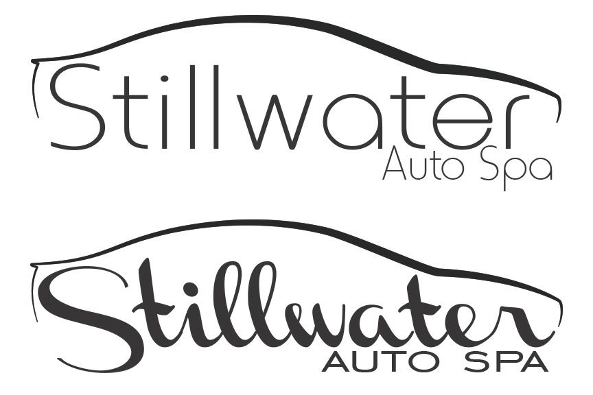
Maybe it's just because I'm active here but I realize the profile seems overused in logo designs for the detailing world. I have yet to see someone using this idea around my area though so I went with it. It's just such a simple and eye catching design that I couldn't really help it. In an effort to personalize it though and not look exactly like everyone else I modeled the profile after my own car.

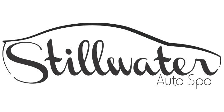
I need a little input on the font though. I have my favorite in mind but I'll keep that to myself for right now. I'll tweak the final design somewhat and the final will have the auto spa at the bottom I just didn't transfer it to all of them. So if I could get a little input on font style I'd really appreciate it. If you have any critiques I'm open to that as well. Thanks guys!
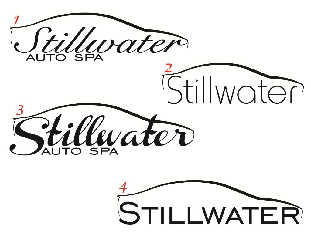
46062746-f217-49dd-a361-69f5aa2c131c_zps348486dc.jpg~original
 
I like the way the silhouette lines and the text flow in 1.

Rick
 
I like the style font used on #3 plus the "r" attaching to the silhouette is a cool touch IMHO.
 
1 is the best out of what you have here.

I'd like 3 if you can make the text fit better within the silhouette of the vehicle.

I like the boldness of 4 but the "S" seems out of place, maybe a bit too big. Also I'd italicize the text a little.

2 seems simple and like it was done quickly.

Also, consider changing the direction of the italicization to lean to the left, as if it were moving with the car.

My opinion is to stick with 1 and just change the direction of the italicization.

Thanks Kyle and everyone else so far. I can't easily change the direction of the text in #1, that's just the flow the designer went with. #2 and all of them for that matter were done pretty quick, I was just dropping in fonts that I was ok working with. I plan on tweaking everything in the final version to fit right and get the kerning and what not perfect. I did play with your suggestion on 3 though because that honestly the one I'm leaning towards.

Here's an update to #3.
leftSlant_zps840e8b49.jpg~original


I'm still not 100% though, there's things I like about all of them really. I like how the r in #1 seems to make a headlight, #3 I like how the text flows with everything as someone mentioned. #2 I really just like that font, not so sure how I feel about it here though but it's very legible. #3, also very legible and a solid font but with "auto spa" I feel like there should be a little more movement in the form of the logo.
 
Just my opinion:

I prefer no. 4 because it is very easy to read. But maybe with more bold letters.

Bold like no. 3
 
I actually like the font in #2. To me it seems more upscale, sophisticated, modern. I think it would look better if the letters were smaller and the " auto spa" could be worked in there.
 
Tough crowd to get a consensus from! ;) Well these two seem to be popular choices here and from the family. I'm having a tough time deciding myself. The block text is growing on me more though, legibility is instant on that one.

updates_zps2c836b1f.jpg~original
 
I like the second option between the two.
 
Thanks JSou.

I can't stop messing with it. I'll get what I want eventually, sorry for throwing my brainstorming at you guys!

flow_zps64e4ad55.jpg~original
 
I favor easy to read rather than a fancy font.
 
Number 4.

- It's clean
- Easy to read on anything you print or stitch it on
- towels
- shirts
- smaller items
- Looks professional and simple
 
I like #1 the best. I think it flows the best.

Sent from my SCH-I535 using AG Online
 
3

Having the artistic eye of an ant...as a customer only, that was the one that hit me.

Bill
 
Personally, I think the silhouette logo for detailing companies is played out. It's not that those logos are bad. My honest feedback is to hit the drawing board and come up with something unique. If you must, pay a professional to come up with a corporate image.

With one google image search check out how many silhouette logos there are: https://www.google.com/search?q=det...45&bih=890#q=car+detail+company+logo&tbm=isch
 
Back
Top