Being a consumer more than a retailer and a former web designer, I can offer you my perspective on the design of your site.
When I look at your homepage, your banner and menu bar take up almost 1/3 of my screen. The logo, while nice, really does nothing to advertise your business or get the browser to his or her destination. I would reduce the size of your logo and perhaps to something less than 15% of your page height. See
this site for example in terms of incorporating your logo and menu bar into a smaller, simpler division.
The "Fully mobile, registered, insured" + Miata picture is fine to be an incorporated image, but I would include a brief philosophy of your business or perhaps some customer quotes. If you have the resources, rotate the picture to different cars. Perhaps have a flashier car there to begin with.
With the homepage and subsequent subpages, I think you lose a lot of real estate with those oversized links to Facebook, Twitter and GMail. I would make those
much smaller.
For your services page, I would have a brief amount of text explaining your philosophy and perhaps flexibility in your business practices.
When I look at your options, beginning with the "silver" package, I see a lot of red x's. I begin to think -- wow, look at all the stuff you don't do. (Maybe that's your point -- to get people to buy the more expensive packages.) I would think that your bread and butter customers are going to be the Silver Package customers, and they might be compelled to think that you don't offer a lot of services and shop elsewhere. Many of the websites I have visited for detailing start with a basic package and tell you what it is and what you offer. Then when moving up to the "Gold" package, they say "Includes Silver package + this and that and the other things, etc." If you like the vertical arrangement of the packages (and I think it's nice), then put the Diamond package up next to it. You may be able to do this if you eliminate the excessively large links on the right side to Facebook, Twitter, etc.
I would say the same about your "other services" tab.
Do you charge by the hour as well? In my business, not all procedures are the same. One job may take 1 hour, whereas the same "procedure" may take 3 hours for another person -- same price though (I don't get to charge by the hour).
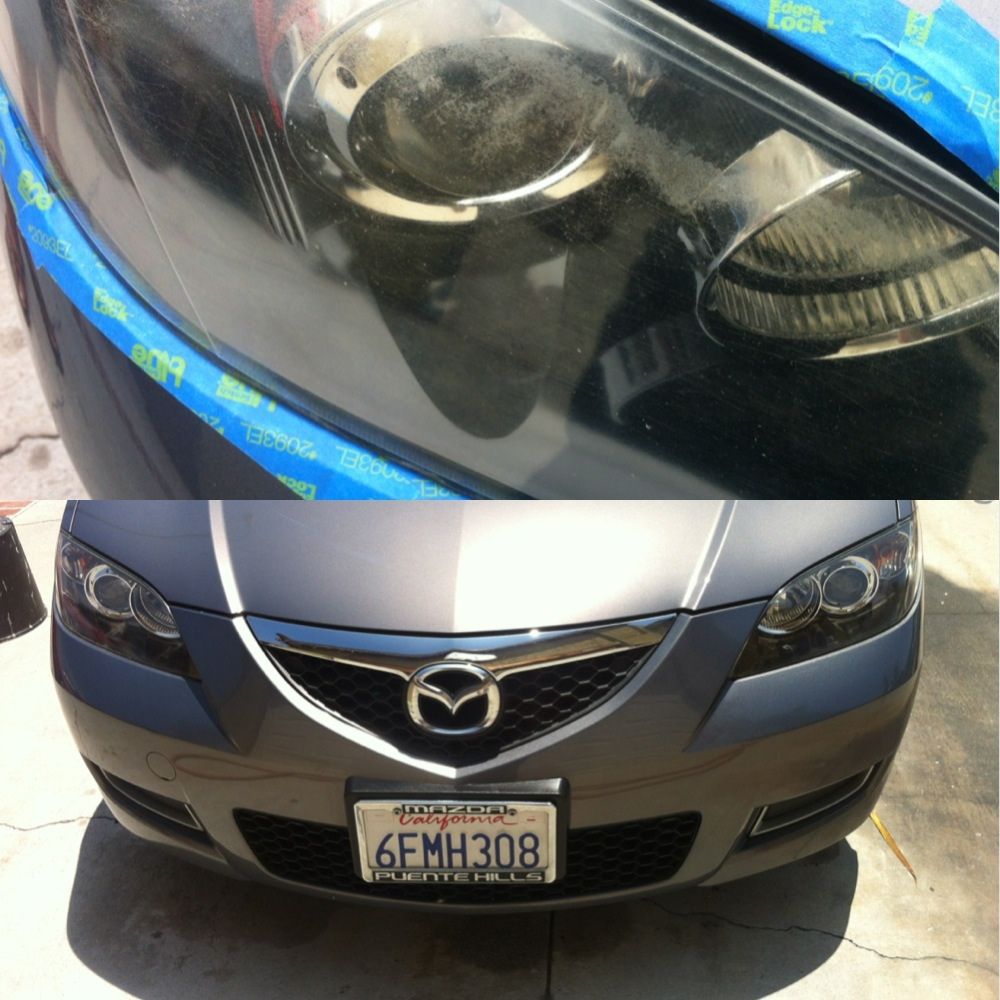
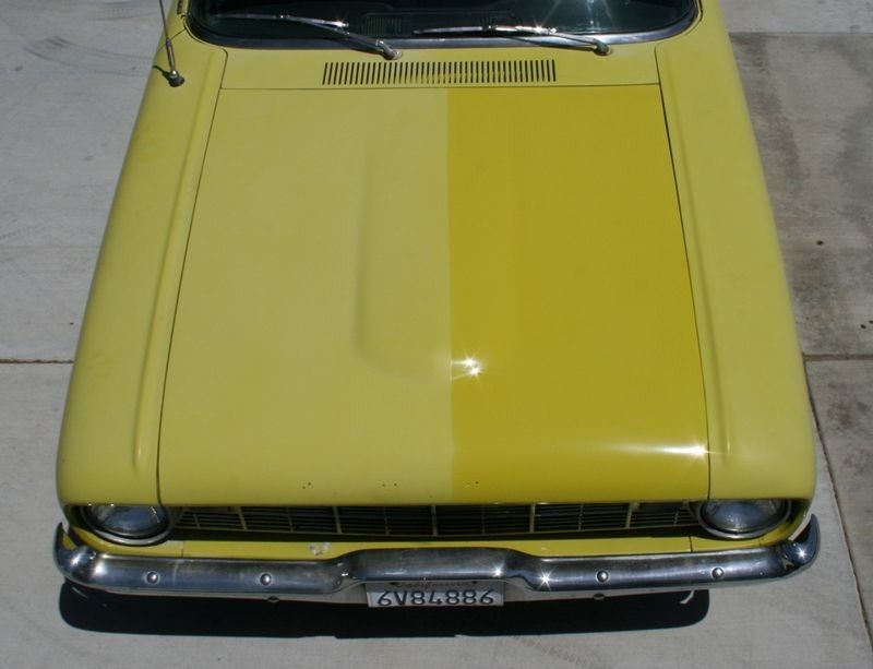
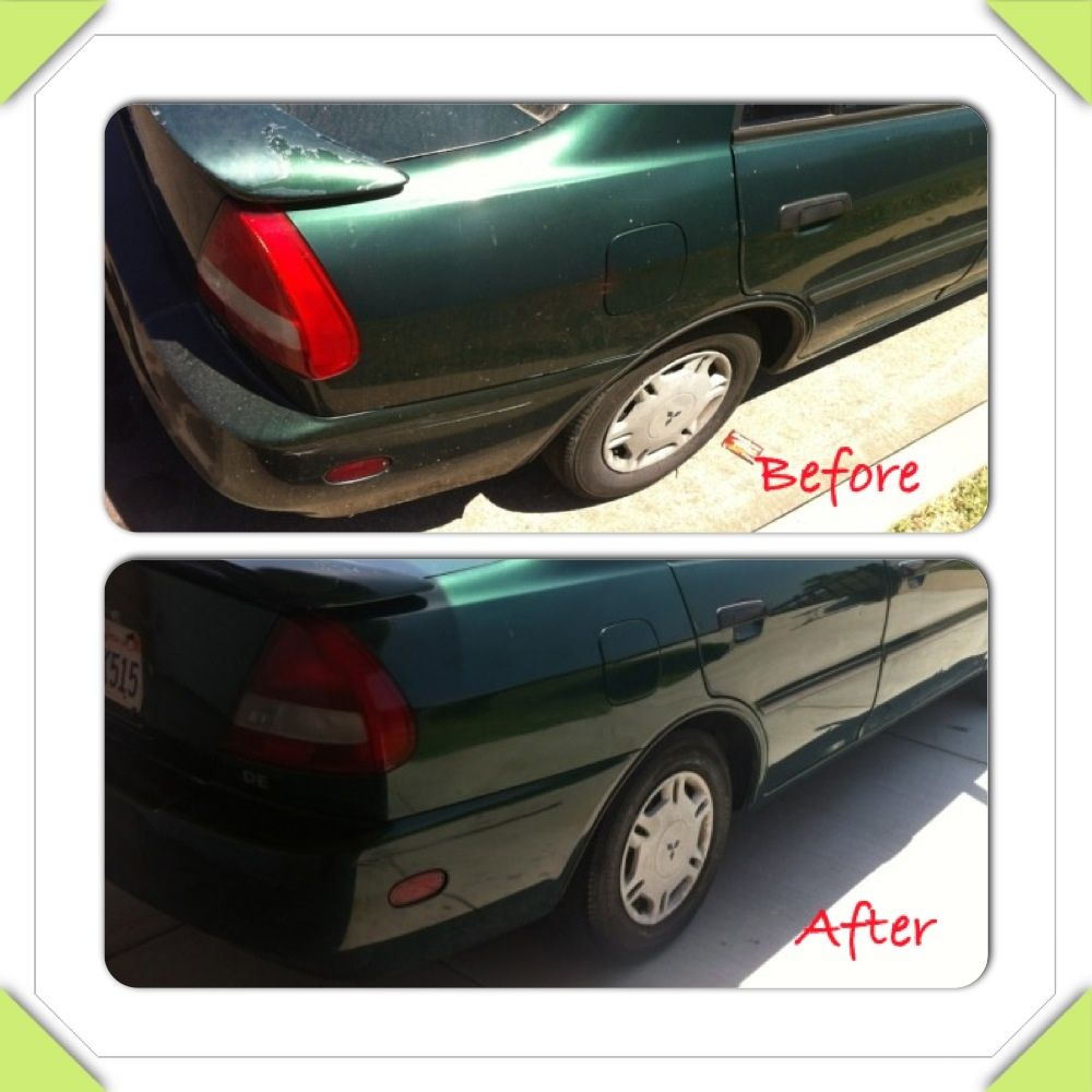
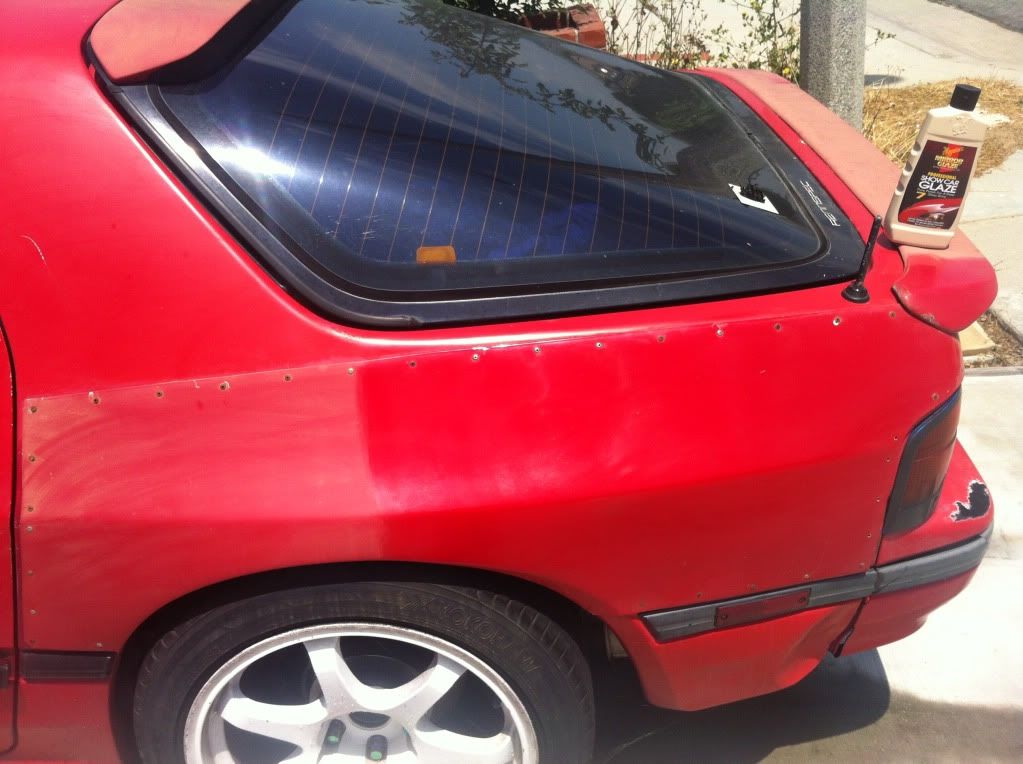
On your polishing page, the before-after shots are nice. Do you have any others? I would also add in some text here about what you do and how you do it. Do you want to talk about the products you use? What's a one stage polish v. two stage polish? What do you mean my car's paint needs to be cut? Maybe a little offerings here about your polishing capacity.
I like your "about" page. Maybe a picture of you and/or your team?
Your "contact" page is nice, but at least on Chrome, your fonts seem a little large.
I like the "blog" page -- it makes me feel as a customer you know what you're doing.
I would also consider having testimonials somewhere in there. Maybe I missed these.
 rops:
rops:")