DFB
Well-known member
- Aug 12, 2019
- 4,980
- 3,151
- Thread starter
- #1,841
Cluster Themes!
I'm going to get this out of the way right now, I like REAL gauges! I've made this analogy a few times, but it sums up my feelings on the demise of traditional gauge clusters. Ask a watch nerd what's their favorite watch, they are not going to name one of the countless "smart" watches on the market are they. A smart watch might technically provide a superior user experience, not to mention the ability to do more than keep time. But thing is, I don't buy a watch to make phone calls or pay for my coffee. And nor is a watch nerd, they want the tactility and old school charm and craftsmanship that comes with a classically designed time piece.


And so, the same applies to car gauge clusters. There is a beauty to a classic set of dials that move with the engine and speed of the car. Yes, you don't have the customizability, but I love seeing the needles dancing in front of me as I drive, it's just part of the experience of driving a car.
Some car companied have gone all in on this trend, some have played a balanced approach. Porsche for instance kept the traditional tachometer with a screen cast around it, which they have only recently changed to a full screen. The previous generation Mustang offered both traditional and digital gauge clusters depending on trim level. For me, what Ford did right was designing the screen to fit within a traditional hooded cluster, so it looked more natural.
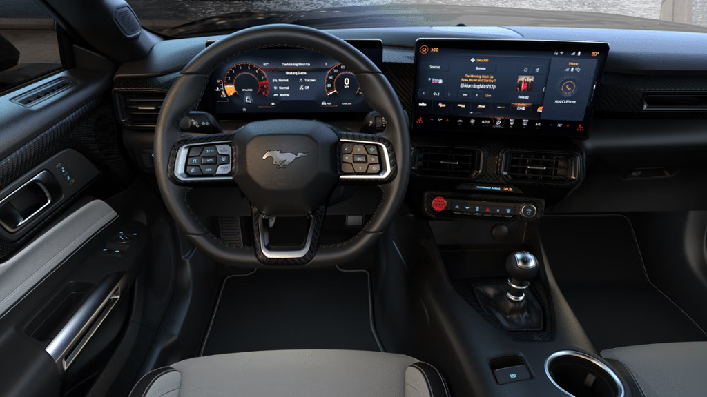
For S650, Ford went all in, the oh so emotive hooded binnacle was canned for a flat, square screen. Actually, there are two versions of this. Lower spec models get two separate screens, one for the navigation/climate control/audio/mode selection, and one for the instrument cluster. High spec models, including all Australian Mustang's, have one large continuous screen. In reality, its actually two screens disguised by a single lens. I remember reading some prefer the two separate screens as it looked more natural and less dominating visually.

At first, I thought this setup was horrible. Ford threw out the traditional twin-hooded dashboard for what looked like something lifted from an Explorer. But here's the thing, if Ford didn't move with the times, they would have been crucified by the press, social influencers and customers. So, while the screens were not my preference, they are integral to the modern Mustang experience.
There is a lot to unpack in regard to the near endless customization offered by the new Mustang. For this post, I'm going to focus on the digital gauge cluster and the seven different themes to choose from.
Ford offer a couple of ways to select which cluster theme you want displayed in front of you. Firstly, if selected, you can have the cluster theme match the drive mode selected via the steering wheel mode buttons, which in theory is most logical. However, if for some reason you don't like Sport gauges with Sport drive mode, you can independently change the cluster, say Sport drive mode with Race Track cluster. This is undoubtably cool, but also somewhat distracting when on the move.
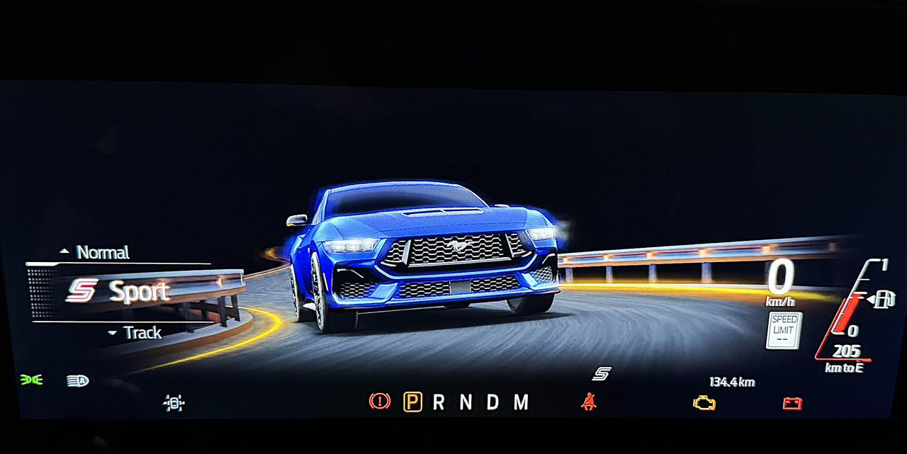
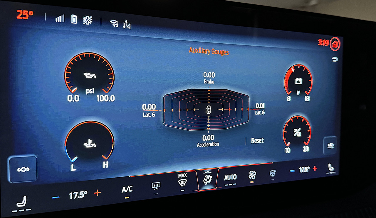
To independently choose a cluster design, press the pony button in front of the gear shifter to bring up the My Mustang page. From here, you can change a variety of settings including Track Apps (Line Lock and Drift Mode), display auxiliary gauges, customize the ambient and display lighting via the My Colour Tab, change the exhaust mode, select a gauge cluster theme, or create and store a custom mode with 6 different presets.


Once you select the Cluster Theme tab, you can then scroll through and select one of the 6 designs on offer. The theme will be displayed on in front of the driver as well as the main touchscreen to show your selection.


So, lets run through the themes on offer.
Calm - This is a very basic mode designed for the least distraction. I can't see myself ever using this mode.

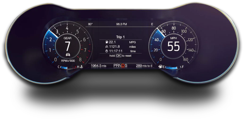
Normal - I think this is the most visually cohesive, if a little un-Mustang like. It's clean, clear and modern. I also like how it simulates two traditional round gauges when compared to the next two.

Sport - This design I find a little hard to read. It certainly looks cool but lacks legibility at a glance.

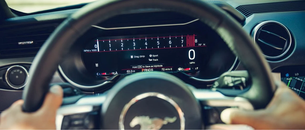
Race Track - This theme removes a lot of the fluff to preset a very clear tachometer and a basic digital speed readout. Probably not my favorite, but I like how it bounces tachometer bar between gear shifts.

And now for the fun ones!
Fox Body '87 - '93 - When the S650 was unveiled, Ford got Mustang fans raving about the cluster theme that matched the green backlit gauges of the Fox Body Mustang's from the late 80's and early 90's. Actually, that green backlighting was not unique to Mustang, all US Ford's were the same. At first, I didn't see the appeal, why make your brand-new car look 30+ years old? However, this theme is simple, clean and is extremely easy to read. Although, no Fox Body could reach those engine or ground speeds.

Classic '67 - '68 - This design was only introduced a few months ago and is pure indulgence. It's not as legible as it could be due to the odd speed gradients, but it's undoubtably cool and a nice touch by Ford. My salesman chose this theme for delivery day, quite fitting with a classic Mustang parked right next to it in the delivery bay.

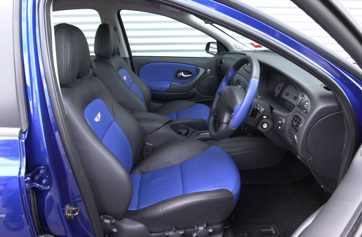
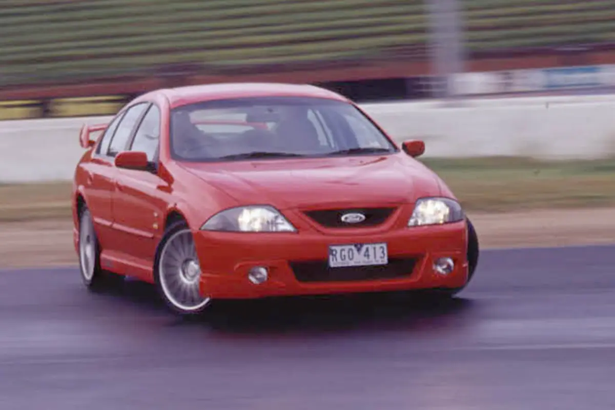
SVT Cobra '99 - '01 - Also recently introduced, this design will be recognizable for those familiar with the Mustang Cobra's Tickford converted to RHD back in the early 2000's for Ford Australia. Like the Fox Body theme, this setup is clean and very easy to read.

I will say, all three of these heritage cluster themes lack a digital speedometer, which is understandable considering the originals never had one either. However, with the 30 kph numbered increments, it can make typical Australian speed limits hard to sight. So, I would say be careful with this, especially for those in the same nanny state I live in.
So, which is my favorite? I really like the look of heritage cluster themes, especially the '67 - '68. However, I can see myself using the SVT Cobra design most, it's so clean and clear. Of the modern versions, I like the basic Normal setup. Boring, but again, it's cleaner and easy to read than the other options.
I'm going to get this out of the way right now, I like REAL gauges! I've made this analogy a few times, but it sums up my feelings on the demise of traditional gauge clusters. Ask a watch nerd what's their favorite watch, they are not going to name one of the countless "smart" watches on the market are they. A smart watch might technically provide a superior user experience, not to mention the ability to do more than keep time. But thing is, I don't buy a watch to make phone calls or pay for my coffee. And nor is a watch nerd, they want the tactility and old school charm and craftsmanship that comes with a classically designed time piece.
And so, the same applies to car gauge clusters. There is a beauty to a classic set of dials that move with the engine and speed of the car. Yes, you don't have the customizability, but I love seeing the needles dancing in front of me as I drive, it's just part of the experience of driving a car.
Some car companied have gone all in on this trend, some have played a balanced approach. Porsche for instance kept the traditional tachometer with a screen cast around it, which they have only recently changed to a full screen. The previous generation Mustang offered both traditional and digital gauge clusters depending on trim level. For me, what Ford did right was designing the screen to fit within a traditional hooded cluster, so it looked more natural.
For S650, Ford went all in, the oh so emotive hooded binnacle was canned for a flat, square screen. Actually, there are two versions of this. Lower spec models get two separate screens, one for the navigation/climate control/audio/mode selection, and one for the instrument cluster. High spec models, including all Australian Mustang's, have one large continuous screen. In reality, its actually two screens disguised by a single lens. I remember reading some prefer the two separate screens as it looked more natural and less dominating visually.
At first, I thought this setup was horrible. Ford threw out the traditional twin-hooded dashboard for what looked like something lifted from an Explorer. But here's the thing, if Ford didn't move with the times, they would have been crucified by the press, social influencers and customers. So, while the screens were not my preference, they are integral to the modern Mustang experience.
There is a lot to unpack in regard to the near endless customization offered by the new Mustang. For this post, I'm going to focus on the digital gauge cluster and the seven different themes to choose from.
Ford offer a couple of ways to select which cluster theme you want displayed in front of you. Firstly, if selected, you can have the cluster theme match the drive mode selected via the steering wheel mode buttons, which in theory is most logical. However, if for some reason you don't like Sport gauges with Sport drive mode, you can independently change the cluster, say Sport drive mode with Race Track cluster. This is undoubtably cool, but also somewhat distracting when on the move.
To independently choose a cluster design, press the pony button in front of the gear shifter to bring up the My Mustang page. From here, you can change a variety of settings including Track Apps (Line Lock and Drift Mode), display auxiliary gauges, customize the ambient and display lighting via the My Colour Tab, change the exhaust mode, select a gauge cluster theme, or create and store a custom mode with 6 different presets.
Once you select the Cluster Theme tab, you can then scroll through and select one of the 6 designs on offer. The theme will be displayed on in front of the driver as well as the main touchscreen to show your selection.
So, lets run through the themes on offer.
Calm - This is a very basic mode designed for the least distraction. I can't see myself ever using this mode.
Normal - I think this is the most visually cohesive, if a little un-Mustang like. It's clean, clear and modern. I also like how it simulates two traditional round gauges when compared to the next two.
Sport - This design I find a little hard to read. It certainly looks cool but lacks legibility at a glance.
Race Track - This theme removes a lot of the fluff to preset a very clear tachometer and a basic digital speed readout. Probably not my favorite, but I like how it bounces tachometer bar between gear shifts.
And now for the fun ones!
Fox Body '87 - '93 - When the S650 was unveiled, Ford got Mustang fans raving about the cluster theme that matched the green backlit gauges of the Fox Body Mustang's from the late 80's and early 90's. Actually, that green backlighting was not unique to Mustang, all US Ford's were the same. At first, I didn't see the appeal, why make your brand-new car look 30+ years old? However, this theme is simple, clean and is extremely easy to read. Although, no Fox Body could reach those engine or ground speeds.
Classic '67 - '68 - This design was only introduced a few months ago and is pure indulgence. It's not as legible as it could be due to the odd speed gradients, but it's undoubtably cool and a nice touch by Ford. My salesman chose this theme for delivery day, quite fitting with a classic Mustang parked right next to it in the delivery bay.
SVT Cobra '99 - '01 - Also recently introduced, this design will be recognizable for those familiar with the Mustang Cobra's Tickford converted to RHD back in the early 2000's for Ford Australia. Like the Fox Body theme, this setup is clean and very easy to read.
I will say, all three of these heritage cluster themes lack a digital speedometer, which is understandable considering the originals never had one either. However, with the 30 kph numbered increments, it can make typical Australian speed limits hard to sight. So, I would say be careful with this, especially for those in the same nanny state I live in.
So, which is my favorite? I really like the look of heritage cluster themes, especially the '67 - '68. However, I can see myself using the SVT Cobra design most, it's so clean and clear. Of the modern versions, I like the basic Normal setup. Boring, but again, it's cleaner and easy to read than the other options.


 )
)


")