Harry Da Hamster
New member
- May 13, 2013
- 863
- 0
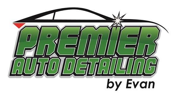
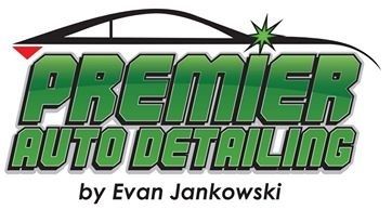
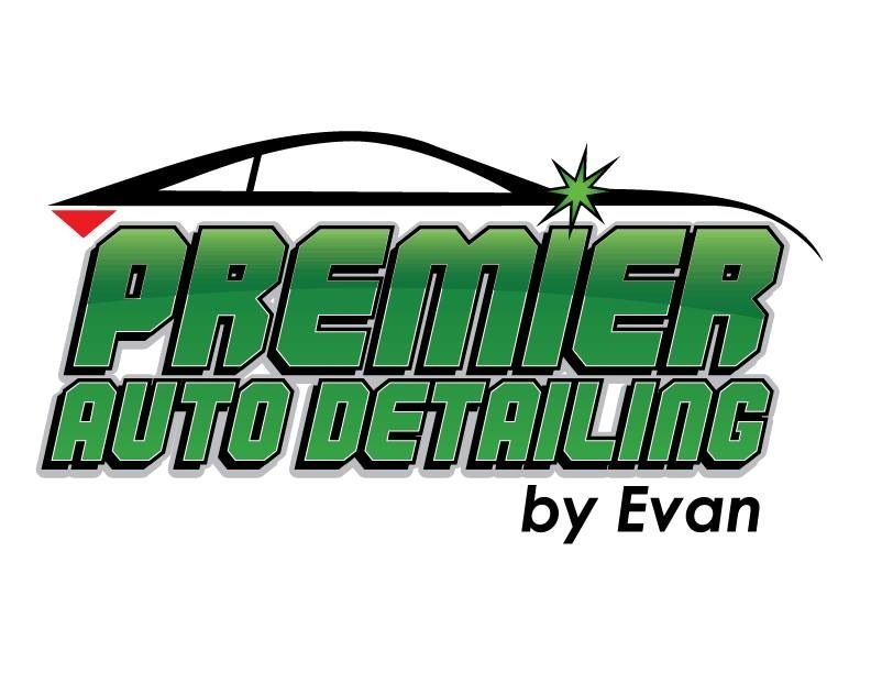
I like the chartreuse! :laughing:
The thin black border makes the wording pop!
The thin black border makes the wording pop!
Follow along with the video below to see how to install our site as a web app on your home screen.
Note: This feature may not be available in some browsers.

Keep in mind that the shade of green will come out differently when printed than it does on screen due to CMYK ink vs rgb screens. I think getting the type of green right is going to be your biggest challenge. Don't settle for anything less that fantastic, because its a very long term thing that you will see every day
The blackI like the chartreuse! :laughing:
The thin black border makes the wording pop!
Perhaps you can ask the graphic designer to try this:
1) slant the B pillar and,
2) see the area that kicks up at the rear window, give that a try.
Looks great! I would just leave your name out, (no offence) but it would look alot cleaner
I'm a little late to this rodeo.....
I like the toned-down green, and the stoke around the letters is a HUGE improvement.
3 suggestions:
1. I'd line up the G in Detailing so it ends where the R does above it (note the P and the A line up perfectly).
2. If your name is going to be in it, I would move it so it is left justified rather than centered.
3. Change the leading (or line spacing) on your name to match that of the other lines.
What would look bad-ass is if that gradient followed the lines of the car instead of just arching... I mean if it reflected where the wheel wells would be :xyxthumbs:
 rops:
rops:
")