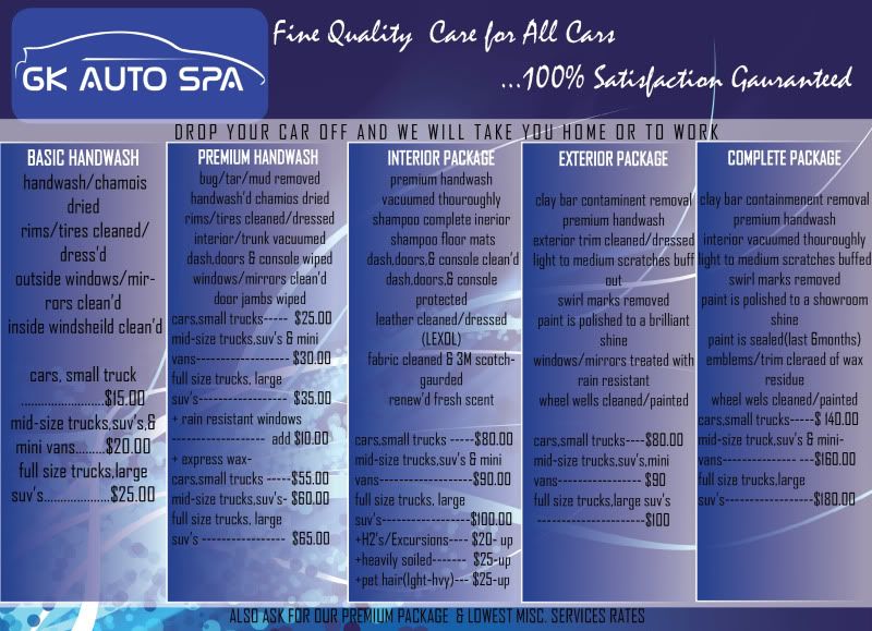
My flyer design(not final)

GK Auto Spa

New member
Joined
May 23, 2010
Messages
193
Reaction score
0
These are an example of my flyer design! I won't commit to this design it's TOO BUSY for my taste,but a good start. I gave the info to the guy last night & im amazed that he has something to show alreadii!

Front
GKAutoSpa.jpg


Rear
GKAutoSpa2.jpg
 
The Flyer looks good, I agree with you, it is extremely busy (way too much info) being in Sales and Marketing for over 15 yrs ( Adverting also) one of the many things I learned was to keep it simple, stress your product, but don't overkill with too much information, its like fishing, give them a taste, but don't give the whole bait away....the pricing is one thing I would certainly remove....sell them on your skills and services rather than pricing...also, that could give someone sticker shock (not saying your prices are too high or too low) other than that...it looked great to me. My wife and I do flyer blitz in upscale neighborhoods ever so often(Rainy Days are great to do this) the return isn't the best in the world, maybe 1 out of 100 flyers you will get a call....but, that's a great way to WOW the customer and get some referrals from them........good luck.
 
The Flyer looks good, I agree with you, it is extremely busy (way too much info) being in Sales and Marketing for over 15 yrs ( Adverting also) one of the many things I learned was to keep it simple, stress your product, but don't overkill with too much information, its like fishing, give them a taste, but don't give the whole bait away....the pricing is one thing I would certainly remove....sell them on your skills and services rather than pricing...also, that could give someone sticker shock (not saying your prices are too high or too low) other than that...it looked great to me. My wife and I do flyer blitz in upscale neighborhoods ever so often(Rainy Days are great to do this) the return isn't the best in the world, maybe 1 out of 100 flyers you will get a call....but, that's a great way to WOW the customer and get some referrals from them........good luck.


What is "flyer blitz"? Simplicity is best in advertising. I wanna communicate on a Dupont Registry level as far as look/writing or whole image. Simple & clear.

i shouldn't be able to see where the logo starts or finish or anything protruding thru other writing or designs.

Thanx for the complement though!
 
Very nice, but a couple thoughts.
I agree too busy.
Dark font on top of dark backgroud not legible.
 
The Flyer looks good, I agree with you, it is extremely busy (way too much info) being in Sales and Marketing for over 15 yrs ( Adverting also) one of the many things I learned was to keep it simple, stress your product, but don't overkill with too much information, its like fishing, give them a taste, but don't give the whole bait away....the pricing is one thing I would certainly remove....sell them on your skills and services rather than pricing...also, that could give someone sticker shock (not saying your prices are too high or too low) other than that...it looked great to me. My wife and I do flyer blitz in upscale neighborhoods ever so often(Rainy Days are great to do this) the return isn't the best in the world, maybe 1 out of 100 flyers you will get a call....but, that's a great way to WOW the customer and get some referrals from them........good luck.
This is the basic flyer that I use, please critique, thanx
 
Very nice, but a couple thoughts.
I agree too busy.
Dark font on top of dark backgroud not legible.


Same thing i say! He revised it for me & STILL im not happy enuff to publish it!

Thanx for the feedback! I "Kinda" like the front with a few adjustments!

Last1.jpg
 
This is the basic flyer that I use, please critique, thanx


I like the fact that you cover different genre's of the automotive industry The TOP NOTCH Bugatti & the Street Rod. So,in other words you aren't discriminating any type of vehicle you clean as long as they KEEP IT GREEN!!
 
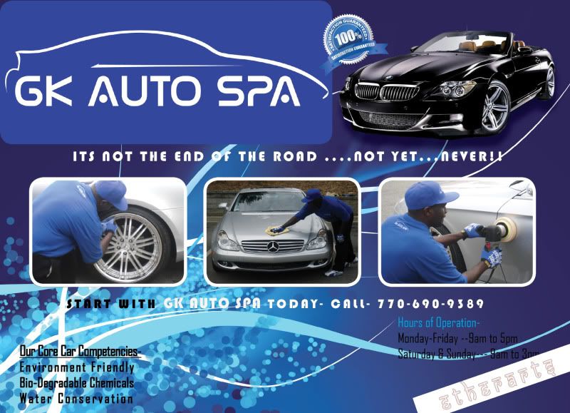
Check your spelling on 'guarantee' on the backside. The font makes it a bit hard to tell - but it looks like it needs a spell check.

I agree that the colors are a bit too dark (gradient) with the black text.
 
the colors i like alot . so for sure keep them..:xyxthumbs:
 
I definately understand your challenge of avoiding wordy flyers as I have often found it difficult to balance offering enough information to accurately represent the service you offer but keeping it streamlined. Your second interation is much more concise and the overall design works very well so great job on that front!
 
the colors i like alot . so for sure keep them..:xyxthumbs:

I definately understand your challenge of avoiding wordy flyers as I have often found it difficult to balance offering enough information to accurately represent the service you offer but keeping it streamlined. Your second interation is much more concise and the overall design works very well so great job on that front!

:iagree:
 
GK,

Ok here are my thoughts about your brochure, the first design was very busy, but the second is pretty plain. There is a certain balance that has to be there between the graphics and copy, remember that the graphics is what will attract the reader to the piece, with the copy be short and concise, what I always go by is features tell and benefits sell. The more benefits the higher the response from the consumer. Nobody wants to read a brochure that will tell them how to do it, they what to know what they will get as a end result and that is where your benefits come in.

I would definitely not list your prices, this limits your brochure shelf life and locks you into prices that you might not be able to meet in the future. Nothing like having to take a hit on a job due to them holding you to outdated prices. "call today for a onsite quote" would be your best option.

Another thing that has me thinking, is this just a one sided 8.5 x 11 flyer? Are you just going to be handing these out by hand or are you going to be mailing these? If you are going to be mailing them remember that you will have to stuff the envelopes and your flyer will be inside NOT being seen. I have personally seen better results from two sided double fold flyers with a back panel for mailing, then a stand alone one sided flyer stuffed into a envelope. Plus you will have the cost of the envelopes to take into consider also. The time to stuff and address and seal the envelopes all costs. It is a lot easier and faster to just take the pre-folded flyer, print and Avery label, slap on a stamp and drop in the mail.

As far as the colors I am fine with that, very soothing, I like the first design, but I would make a few changes

1. Fade back the background graphics, where they come part of the background instead of competing with what you are trying to say.

2. Dark text on dark colors don't work.... Period!

3. Change the font, hard to read. 2 font faces max.

4. Make your logo and contact info very noticeable, you don't want people wondering who you are and how to get ahold of you.


Hope this helps you and if you have any more questions feel free to hit me up, :)
 
My thoughts.

1. For descriptions, I would spell out all words (dress'd, clean'd) and use commas instead of slashes

2. For core competencies, where is being a good detailer? The kerning in the whole competencies should be even.

3. Is the hours really necessary? 7 days a week should be sufficient given your time span -- 7am to 7pm? The light blue (cyan) text is hard to read.

4. Maybe move the 100% guarantee close to the good detailer comment in my second comment.

5. Maybe ditch the call "comment" and just make the phone number a lot larger. or say "For appointments or additional information call...."

6. The blank area below the center pic seems to want something...maybe move the 100% guarantee there and make it bigger.

7. Maybe.

"We welcome you" at top centered
then row of 3 pics
then pricing with 100% in center
then GK Auto Spa in big letters
then phone number
then email
then web site
then one line at bottom of core competencies all in one line
 
Where are you located? or What area do you service? Can't tell from the flyer.
 
I definately understand your challenge of avoiding wordy flyers as I have often found it difficult to balance offering enough information to accurately represent the service you offer but keeping it streamlined. Your second interation is much more concise and the overall design works very well so great job on that front!


Thanks!! He said i had 3 changes & im all out. With my other business this usually happends to me(i run out of time before i get what i need). I wish i had a friend that went to school for Graphic Design,not for cheap rates but to understand my vision!

It's Kool though,i won't give up!
 
I have some input, and it's constructive, though some of it may not seem that way. I love the fact that you're on the same boat as I am in terms of trying to be legit and professional, so here's my input.

1. First and foremost for me, in your pictures, your hat has that straight-brimmed, cocked to the side look to it that SCREAMS unprofessionalism for me. I'm not saying that the ballcap itself is unprofessional, and it could be the angle of the photos, but I'm just not a fan of the "style" of a straight-brimmed, cocked to the side baseball cap in the business world. There's no place for it at all. Save that for picking up women at the club or something. Mechanix gloves aren't meant to be used as detailing gloves unless they actually do make a "detailers" glove. So, in short, lose the baseball cap and put on some latex gloves. The rest of your attire is awesome. I need to get some shirts made myself...

2. I agree with the others, dark text on a dark background doesn't work. You have to strain to actually read what it says and the background is too "part of the advertisement". What I mean is the graphics pull your attention away from the information. It should supplement the information, not take away from it. Your second posting is much better, but whatever that is in the upper left-hand of it needs to go. Looks like Nepalese script.

3. Enlarge your satisfaction guarantee logo and set it centered under the middle photo in the second version or you could put it top left or right depending on your preference.

4. I'd have to really take a look at more of your work, but your prices are WAYYY too low for correction work. ;) I also agree that you shouldn't put your prices on a flyer. On your website, yes, on your flyer, no. Even on your website, make sure you state that all prices are estimates only and size and condition of the vehicle may increase the cost. On a flyer, I'd probably just try to entice the customer to visit your website. Something simple.

Anyway, just my personal preferences, so I hope I didn't offend. Good luck with your designer. I lucked out. My designer is not only a VERY skilled graphic artist, but he's a car guy and did my website, my cards and will design a bunch of other stuff for me in return for a full, hardcore detail of his car. I have no real limitations on how many changes I want to make. You're off to an awesome start though man. :D

Thanks i really appreciate the feedback. I was thinking bout just doing a flyer for the local gas station setup to start off with. basic handwash,premium handwash & wax.

i honestly don't get the NO PRICE on flyer thing. Give me a situation where it would be a hassle or misinformation(if u will)? If a rock crawler/mudder comes in or calls me to do a muddy truck he & i both know it will be an extra charge.

same goes for a faded car or truck. My prices are based on the shops in the area.
Detail Services

Wash, Clean, Detail, D and D Custom Mobile Detailing, Atlanta, GA

Mind you im not trying to expose anyone's business but facts are facts.


My Skills run 10plus years with independants & dealerships. Out of those ten plus years,NO ONE used Meguairs. I started out using PRODUCTION & PRO WAX. They are good but not prefferd by me. My paint correction is thought of as Paint Reconditioning. I can remove swirls,scratchs,etc. Bring the old to new standards. Im sure with the stuff that AG sells my work would be top notch. Most of this stuff i never used before. Im a Meguiars believer because the stuff works.


My exterior package just will be a mild RECON.
My complete package is mainly the int/ex with a lil buff & good sealant
My premium package would be a full on RECONDITIONING,(i guess what yall call a paint correction)$200 - $240 in price (maybe i should reach for more) othings in stone yet

I have intentions to add a LUXURY WAX to my services which will be a Complete Concours/Estate Pkge. it will tak a full day to do & COST upwards of $300.
 
I'm impressed with the honest feedback and each iteration is better and better. Keep your mind open and keep refining.
 
Same thing i say! He revised it for me & STILL im not happy enuff to publish it!

Thanx for the feedback! I "Kinda" like the front with a few adjustments!

Last1.jpg

I personally like your flyer. Your prices seem very reasonable. I would enlarge the print just a bit, as us over 40(target audience)eyes aren't what they use to be

GL on your new business venture Im the MAN
 
Back
Top