Need opinions on my logo

brondondolon

New member
Joined
Nov 12, 2013
Messages
1,254
Reaction score
0
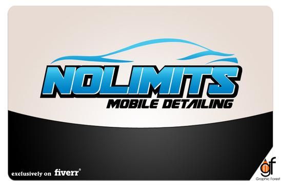
So my logo finally got done. What do you guys think before i tell the guy i like it? Btw only the logo is the logo. The black and white in the background is just to show case it i guess.


logo.jpg
 
I like it but I'd like to see it with some space between "No" and "Limits". So it reads "No Limits" easier than "Nolimits". Besides that, I think it looks great.
 
I like it but I'd like to see it with some space between "No" and "Limits". So it reads "No Limits" easier than "Nolimits". Besides that, I think it looks great.


Yeah i posted it on my facebook and a couple people said the same thing. So im going to email the guy and tell him that as well as adding a little more spacing between the letters so they are easier to read.
 
I had some guy on fiverr.com do it. They do all kinds of things for $5. And for $5 the work is pretty good in my opinion.
 
Maybe stretch out the bottom of the T & S, so it and the O make the wheels of the car. I like it though.
 
You're kidding! Five Dollars!?!
It looks great! Eye catching and quickly gets the point across. It does exactly what you want a logo to do. :props:
 
Haha thanks! Yeah only $5 bucks on fiverr.com haha. The only thing is they take their sweet time and lag at replying to your questions... For instance its going to take 7 days to space No and Limits but for 5 bucks i cant complain.
 
Learn Photoshop. You could make that in 15 minutes. It will save you a lot of money in the long run!
 
Yeah crappy thing is I have Photoshop but my disk was all scratched up so I couldn't install it on my new comp :/ so I figured $5 was cheaper then a new disk.

Sent from my HTC6435LVW using AG Online
 
Yeah crappy thing is I have Photoshop but my disk was all scratched up so I couldn't install it on my new comp :/ so I figured $5 was cheaper then a new disk.

Sent from my HTC6435LVW using AG Online

You can download it from adobe.
 
Back
Top