sullysdetailing
New member
- Mar 7, 2009
- 1,963
- 0
- Thread starter
- #21
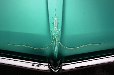
Which font is your favorite
Follow along with the video below to see how to install our site as a web app on your home screen.
Note: This feature may not be available in some browsers.
Which font is your favorite
One more vote for the middle. I quite like that one.