Navigation
Install the app
How to install the app on iOS
Follow along with the video below to see how to install our site as a web app on your home screen.
Note: This feature may not be available in some browsers.
More options
Style variation
You are using an out of date browser. It may not display this or other websites correctly.
You should upgrade or use an alternative browser.
You should upgrade or use an alternative browser.
New logo...thoughts?
- Thread starter jarred767
- Start date

thatrabidhobo
New member
- Nov 27, 2014
- 9
- 0
I really, really like the new logo, and even better it's not another car silhouette. If it were to be my logo I would like to see how it looked with the mountains a little more slender to make it look more like an "M". But, it probably looks great as is.
jarred767
New member
- Jun 30, 2014
- 871
- 0
- Thread starter
- #24
Thanks everyone, I'm really lovin it and it's really growin on me. I can't wait to get it all finalized and start plastering it on all of my stuff. Still trying to decide on the line vs no line question I posted on page 2 of this thread, but pretty set on overall. This whole transition is feelin better and better by the day! 49 days til the big move!!!
Thanks, that's really appreciated. I felt like the car silhouette was a little over-done (no offense to those that have it, just not for me) and with the mountains it is appealing to my new city. Plus the little shine addition almost kinda looks like the sun setting behind the mountains too!
I tried going a little narrower on the mountains and it started looking a little funny and they didn't look like mountains anymore, so I felt this was the best compromise between looking like an M and mountains at the same time. Appreciate the advice though!
I really, really like the new logo, and even better it's not another car silhouette. If it were to be my logo I would like to see how it looked with the mountains a little more slender to make it look more like an "M". But, it probably looks great as is.
Thanks, that's really appreciated. I felt like the car silhouette was a little over-done (no offense to those that have it, just not for me) and with the mountains it is appealing to my new city. Plus the little shine addition almost kinda looks like the sun setting behind the mountains too!
I tried going a little narrower on the mountains and it started looking a little funny and they didn't look like mountains anymore, so I felt this was the best compromise between looking like an M and mountains at the same time. Appreciate the advice though!
jarred767
New member
- Jun 30, 2014
- 871
- 0
- Thread starter
- #25
Thanks to all of those with suggestions on this it was very helpful. I settled on this one:
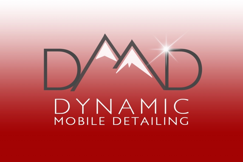
Depending on what medium it's on it may or may not have the gradated background, but the logo will remain the same.
I'm super stoked to start making up cards, getting it on my new website, t-shirts,?putting it on my car and just getting everything switched over.
45 days and counting til the re-launch. :xyxthumbs:
thatrabidhobo
New member
- Nov 27, 2014
- 9
- 0
Looks really slick. Classy, simple, easy to print because it's only two colors... Good stuff.
brondondolon
New member
- Nov 12, 2013
- 1,254
- 0
Im not sure how i feel about it. In my opinion it doesnt symbolize what you do. On top of that I read DAAD. Just my .02
Edit. I said that before I saw the revision. I think its getting better.
Edit. I said that before I saw the revision. I think its getting better.