New logo, what do you think?

hemi ram55

New member
Joined
Mar 13, 2011
Messages
77
Reaction score
0
MMDLogoFinal.jpg


So this is my new logo. Took about a month to finalize and tweak. Started with about 20 different logos and ended up with this one. I put it up for a vote on fb and got a lot of feedback and thats how i came up with this. figured i would post it up here, kinda proud of it Im the MAN.
 
since u looking for feedback , I don't really care for the flames either . if ya can add a pic with no flames and we can do a vote here ? also the m.m.d is not centered in the logo as the left side seems slightly larger than the right side ? good design otherwise . tweaking needed .
 
With no flames you then should change the lettering around logo which are now flame color to yellow to match yellow sun.
 
I'm with everybody else on the flames. I also don't really understand the checkered flags. I've seen so many detail shops use racing flags, and I don't understand why. Nothing about what we do involves racing, winning a race, or even going fast.

The previous owners of my business did this as well...and the first thing I did was remove all things related to checkered flags. I feel the checkered flags sort of give the impression that you may deal with performance parts. The flames I feel give the impression you may do custom paint, or something of the sort.

I love the lay out of the logo though. Everything is spread out nicely, the colors are good. Just those two things for me. Also some centering is in order. :dblthumb2:
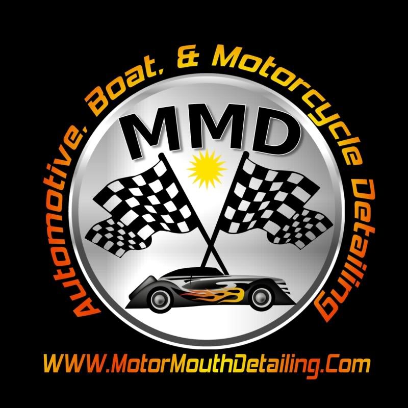
 
No flames IMO...just doesn't quite flow with the other colors on the car or the car in general. Personally I'd put an exotic car on their instead, but that's just my own personal preference.
 
I agree w/ removing the flames & flags. Maybe consider adding a boat & bike graphic since you do those as well.
 
Back
Top