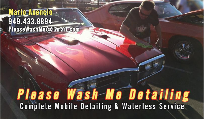
Share your best business card design tip?

Hey guys, I just got my Business card this week...
I really recommend a "Plastic" Business card...
I used a Clear Plastic card, that way the card Looks like it is 3D, and you could actually see everything behind the card...
Letters and Images are Floating...

You should try this, I thought it could be a great Idea especially for Detailing Services.

Pictures?!
 
Hey guys, I just got my Business card this week...
I really recommend a "Plastic" Business card...
I used a Clear Plastic card, that way the card Looks like it is 3D, and you could actually see everything behind the card...
Letters and Images are Floating...

You should try this, I thought it could be a great Idea especially for Detailing Services.

Post pics ! Where did you get it done at ?
 
Alright, here you go,
My new Plastic Clear Business Cards Photos
:Picture:

img2979mc.jpg


Here You could see how clear it is, White Ink = Clear

img2980rb.jpg


Just type Plastic Business Cards on google, choose the best site that fits you.
 
My current card is two sided. (I'm changing my name)
Main side is a picture that happend on day demonstrating a spray wax at a car show. It's a 50/50 of a show car with me in it.
The second side is of the famouse B17 at Lyon Air Museum owned my William Lyon who is my neighbor and is very popular with the wealthy around me. Joe was nice enough to let me use this pic and yes I polished it!

front_sample1_zps3ad8f8ac.jpg


GHGHRGHTRH_zps7154d905.jpg
 
In my opinion, and how I did it (starting up with a friend of mine), I think a bussiness card should be very simple in the front, that let's you know what's it all about without having to look for the name...
on the back, you can put lots of info.
 
Follow this:

K.I.S.S.

Keep It Simple Stupid

Less is more, trust me and check out Vista Print, great deal on your 1st 250 cards, couldn't be happier!

Sent from my SPH-M930 using AG Online
 
I made this one using Adobe Illustrator on a school computer, I'd say it came out pretty good. (The color is a lot darker in person, don't know why it looks so bright online) Nice and easy to identify
 
How about 2 tips.

1. Make sure that your design is clear enough that a business card scanner can identify the name of your business and your phone number. Many people receive a lot of business cards and just feed them through a scanner. If your data doesn't get into their computer, they'll never find you again.

That means clear fonts for the important information, and organizing the data on the card intelligently.

2. When I had the computer service techs, I did fancy cards for all the techs that were high gloss on both sides. We quickly discovered that we couldn't write anything on the card. When you are having personal contact, it's really convenient to be able to add information on an ad hoc basis. An appointment time, a time to call, etc. If you can't write it on the card, you have to put it on a piece of paper, which increases the chance of it being lost.

Keep the high gloss finish to one side of the card, and plain on the other.

Jim

Great tip(s)!

Bill
 
How about 2 tips.

1. Make sure that your design is clear enough that a business card scanner can identify the name of your business and your phone number. Many people receive a lot of business cards and just feed them through a scanner. If your data doesn't get into their computer, they'll never find you again.

That means clear fonts for the important information, and organizing the data on the card intelligently.

I strongly agree with the above.

I see business cards all the time where the person has chosen some flower, scripty, pretty font? What's up with that? Here's the deal... it's not about you... it's about making it easy for your CUSTOMER to contact you.

Use a simple, easy to read font like Arial. Call it boring all day long but don't make people struggle to read your car. Don't make it small either, tiny fonts are hard to read.


The same actually applies to e-mail in my opinion. I get e-mails from people all the time with scripty, flowery fonts and whacked out colors. Here's a clue... it's not about you... it's about making it easy for your audience to read your words. Use Arial in 12 point font with a white background and black text. KISS or Keep it Simple Simon.

I'm amazed at how much e-mail I get with hard to read fonts. Simply amazed...


2. When I had the computer service techs, I did fancy cards for all the techs that were high gloss on both sides. We quickly discovered that we couldn't write anything on the card. When you are having personal contact, it's really convenient to be able to add information on an ad hoc basis. An appointment time, a time to call, etc. If you can't write it on the card, you have to put it on a piece of paper, which increases the chance of it being lost.

Keep the high gloss finish to one side of the card, and plain on the other.

Jim

Another great tip Jim...

When I meet people it's often times because they have a "car", not the one they're driving but a "real" car, something in the garage that's cool. I remember people more easily by attaching them to their cool car and it's nice to be able to write down on the back of the car, (or front), something like,

1969 GTO


I put this in my contact information too in my cell phone. I often times take a picture of their "cool" car and make that their photo as I can instantly attach the car to the person.


In business, it's not about you, it's about the customer and making everything you do easy for the customer to do business with you. Pretty straight forward.


Another technique to use generally is the SWAT Technique, SWAT stands for,

So What?


Anytime you write anything that's directed at a customer, separate yourself from yourself and put yourself in your customer's shoes.

Read the text and then say, so what? As in... what's in it for me? Because that's how customer's think, they really don't care what's in it for you.


Do a search for a book called,

Make your site sell by Ken Evoy, get it read it.


:xyxthumbs:
 
Yes simple and to the point but make them unique. Something subtle. I work in the printing industry and we have polyester stock that we can run through our digital printers. It's a nice weight and it's water proof. I did square cards used both sides. Black with drop out white text. Simple and clean. The stock is bomb proof. You cannot tear it, bend a corner and they don't get dirty. Yes it's super expensive paper but we always have some extra laying around so no one is gonna miss 25 sheets. Right now my logo is just plain white until I get someone to actually work on it in Illustrator. One guy owes me a huge favor and keeps dodging me. GRRRR. Either my wifey or her sister will do it. I'm hoping for a chrome effect for the logo we will work it out
 
I like Arial too. When I wrote manuals for where I worked, I used it all the time.

It's important to have the information, like phone number, address , etc. easy to read. The logo and other things is to grab attention, but the info has to be readable.

A.P.A.D. has a great card, in my opinion. Easy to read info, and eye-catching design.
 
I am an expert. 20 years as a Graphic designer in print shop and my best advice has always been simple and readable. Everything else is secondary.

Sent from my recliner, using my arthritic thumbs.
 
Hey guy, I just finished the design of my business card. Before I upload it to the printshop I wanted to get your feedback on it.

Front:

recto.jpg


Back:

verso.jpg
 
Back
Top