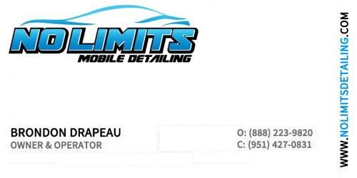
VOTE on my business cards!!! & add ideas

brondondolon

New member
Joined
Nov 12, 2013
Messages
1,254
Reaction score
0
Hey guys. So im designing a business card right now. Ive decided to go with the plastic cards. Not sure if im going to do frosted or completely clear yet. The ink though will not be clear at all. So ive designed a few and would like your opinions. I will number the cards in order so to cast your vote just say #1 or what ever number you like. Also if there is any constructive critisizm you can add id greatly appreciate it. This is my first time using photoshop so i dont know how to add crazy things or effects. Heck i had a hard enough time just changing the color of the font lol. So any way any opinions will help. Thank you!:xyxthumbs:

***WHITE AREAS WILL BE CLEAR PLASTIC OR FROSTED WHITE PLASTIC***


VOTE FOR #1

businesscard.png


VOTE FOR #2

businesscard2.png


VOTE FOR #3

businesscard3.png


VOTE FOR #4

businesscard4.jpg


Thanks guys also if you want to help a fellow member out id be happy to email the card in .png so any one who wants to can critique it for me. :)
 
Should i put all the pics in jpeg so its easier to read?
 
Hey guys. So im designing a business card right now. Ive decided to go with the plastic cards. Not sure if im going to do frosted or completely clear yet. The ink though will not be clear at all. So ive designed a few and would like your opinions. I will number the cards in order so to cast your vote just say #1 or what ever number you like. Also if there is any constructive critisizm you can add id greatly appreciate it. This is my first time using photoshop so i dont know how to add crazy things or effects. Heck i had a hard enough time just changing the color of the font lol. So any way any opinions will help. Thank you!:xyxthumbs:

***WHITE AREAS WILL BE CLEAR PLASTIC OR FROSTED WHITE PLASTIC***


VOTE FOR #1

businesscard.png


VOTE FOR #2

businesscard2.png


VOTE FOR #3

businesscard3.png


VOTE FOR #4

businesscard4.jpg


Thanks guys also if you want to help a fellow member out id be happy to email the card in .png so any one who wants to can critique it for me. :)

I presume the O: means "overhead" as in land line. If so, I'd use P:

From a layout & design standpoint:

If you like the slanted logo with the car, it should slant the other way. It's psychological. Because people read English from left to right it has some "pull" to it. If you slant it going uphill to the left, it leaves them thinking it is more powerful. Why most truck adds you see are pulling uphill to the left. Fact.

I don't like number 4. Too much white space. Actually, what they call trapped white space. Not #1--too busy.

Lastly, since you have a web site, why not e-mail you there? Create a nld@ or an info@ your website so they they don't type as much though.


Thanks for the input. The "O" actually stands for office. I was going to spell the O and the C out (office, cellphone) but it took up to much room. The thing to consider with the white space is thats actually going to be clear since the cards are clear plastic. I was having a hard time with the cards because its like to much info takes away from the clear factor and not enough info makes it look to empty.
 
I would suggest using: "HOME" or "OFFICE" & "CELL" instead of O & C. Otherwise, they all look good IMHO.
 
I like 3. If you do 1 change clean to detail


Sent from my iPhone using Tapatalk
 
I like 3. If you do 1 change clean to detail


Sent from my iPhone using Tapatalk


I used the word cleaning instead of detailing because there are only 2 mobile detailers out in my area so i figured some people might not even know what detailing is since they arent regularly exposed to it lol as sad as it sounds haha.
 
Maybe its just me but, no mention of your service area? :confused:
 
Ok so im going to go with #3. I added to it let me know what you think


businesscard3final2.png
 
Is it better with the blue bar thinner and the addition of serving northern nevada?

businesscard3final3.png
 
I like the thinner bar


Sent from my iPhone using Tapatalk
 
I like the thinner bar and #3 for sure.

You could ditch the owner operator if you really wanted too make it less cluttered. I like the clear business car idea. Mine have a small little paragraph on the back though.
 
Thanks for all the help guys :) I'll be ordering the last posted card tomorrow. Might fine tune it a little but that's pretty much it. I'll post a pic when I receive it :)

Sent from my HTC6435LVW using AG Online
 
3 looks pretty good.

Can you get a sample (proof) from them first on the clear? The lighter blues may be hard to read on clear and you would want to see that first before investing. We are seeing it on white here.
 
Back
Top