New logo design. Input needed on 3 possibilities...

tmurph01

New member
Joined
Oct 25, 2013
Messages
75
Reaction score
0
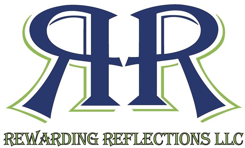
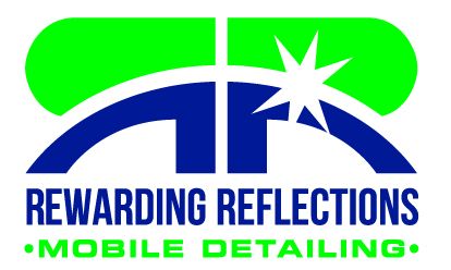
Working with a friend of mine on finally getting a professional, unique logo designed. Below are the three we have come up with:


I am leaning toward going with something similar to the first one with the reversed Rs or the last one with the word Reflections in script. I really like the first one as it is very similar to my original logo and I like the look of the "reflected R", but it just seems like it is missing something. One thing I would change is to make the name all one color, and mobile detailing the opposite color. The design within the Rs also seems almost spacey instead of detailing.. not sure what could be changed to fix that.

The 3rd one is simple and elegant, but it just seems like it is missing something.

Any and all input is appreciated before I get with him on any ideas or changes.
 
I like the first one. Has some impact, easy to read and looks nice.

Yeah, i am partial to that one. Below is my original logo when I first started. It was a simple design I came up with on microsoft word. I liked it, but was never really 100% happy with it. I think with some tweaking, the new revision of it could be a winner...

 
Hi all! Im new to the forum, this will be my first post. I have a couple of questions:
Will this logo have a specific use? for example, business card use? automobile add?, or for building use?
Depending on what this is for you could start tweaking the logo accordingly.
I learned in my advertising class that logos should be easy to read. I really liked the first one but I had to really pay attention and force myself to read it to comprehend the cursive font. If this logo was to be used in an truck/van, I would say lessen the cursive for "mobile detailing" and maybe make it a bit bigger. This way onlookers can get a really good idea of what you are offering. My professor always used to tell me "remember you only have seconds to grab the customers attention and educate them."

I really like the first one. Maybe lessen the streaks on the left R and fade the color on the right R as to make it appear a reflection.

Good point about making the cursive a bit larger and easier to read. I had been thinking the same thing. The logo will be used on all business material. Shirts, business cards, flyers, etc. One good thing about the first one, is it can be broken up into three parts if need be... the reversed R image, the text, and the overall image depending on the application and need.
 
The second one is clear easy to read on cards and shirts and lettering for the van.
 
I like #1, however I agree with GSKR about the 2nd one for cards and lettering on a vehicle...
 
I like the first one also, easier to read plus has continuity with your original design
 
Change the cursive that says mobile detailing below the first one and that's PERFECT. I think you should use this logo on ALL of your marketing materials. Imagine how easy you're going to be remembered riding around town with the reflective R's on the side of your vehicle, your business cards, t-shirts, etc. All the other logos are easy to ignore or miss and nothing about the architecture of the words itself is easily to forget.
 
Well,.. after a lot of back and forth and quite a few failed attempts... Here it is the new logo. I am completely happy with how it turned out and it is pretty much what I wanted. Some compromises had to be made though, but I am ok with them.


I too like #1 best for the logo but think that #2 is the "professional" one that presents better on things like letterhead and business cards.
 
I agree with your original post.... #1: name all one color and mobile detailing in green :xyxthumbs:
 
Back
Top