New logo...thoughts?

jarred767

New member
Joined
Jun 30, 2014
Messages
871
Reaction score
0
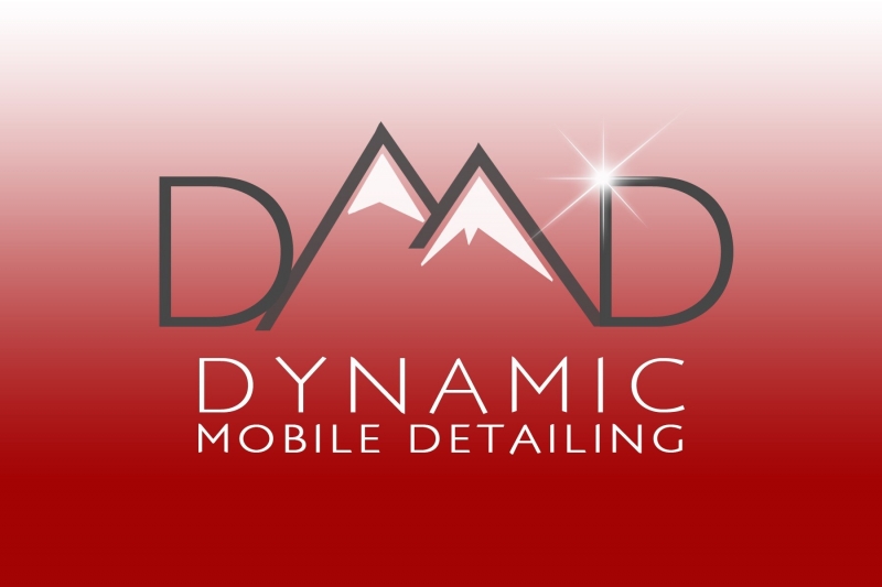
So, not only am I moving out of state, needing transfer an entire business and work 10-12 hour days trying to fit in all my current customers one last time, I figured why not change up all my branding at the same time! There's no such thing as free time right now :surrender: so here's a proof of my new logo, its still in the works, but I thought I get some opinions from you guys in here while I'm still in the editing stage.

image966.jpg


My new town is in the mountains, and very proud if it; I do plan to make the full name larger and bolder, just FYI.

So, what do ya think? Suggestions?
 
Looks good Jarred. Clean, and represents the area you'll be in.
 
I like it, looks clean. My only feedback is to shorten up the left slope of the right mountain a bit more to make more of an 'M'. At first it looked like 'DAAD' to me.
 
I like the idea, but I didn't realize the mountains were supposed to be an "M" until I read your name which as you stated needs to be more prominent.
 
I like it, looks clean. My only feedback is to shorten up the left slope of the right mountain a bit more to make more of an 'M'. At first it looked like 'DAAD' to me.

Looks great, although I agree with this statement. I think then it would be fantastic! :props:
 
IMO.....reminds me of dbl D's and twin peaks found on the female of the species....again...just me....
 
IMO.....reminds me of dbl D's and twin peaks found on the female of the species....again...just me....

I'd say thats a good thing! Most men love Hooters and it's not ONLY because of the wings! :dblthumb2:
 
Thanks for checking it out guys, I really appreciate the thoughts and advice. I'm really looking for a clean and simple look with both the logo and my whole new website. It sounds like on the logo front, I'm heading in the right direction.
I like it, looks clean. My only feedback is to shorten up the left slope of the right mountain a bit more to make more of an 'M'. At first it looked like 'DAAD' to me.
This is great advice, thanks so much! I felt like something was a little off with the M but couldn't pinpoint it. This should help a lot.

^^Looks good! :props: ^^


I'll drink to that... :cheers:


Bob

Funny that you mentioned Coors, cause Bend, OR (the new city I'll be in) is HUGE on beer (a very nice little side-benefit) and has recently been rated as having the most craft breweries per capita (80,000 people at 19 breweries! I won't complain)

I'm working with my graphic designer (my sister) and should hopefully have a new copy of the logo sometime tomorrow. Thanks again guys, and any other tips that anyone else might have are more than welcome.
 
I would remove the D's on the sides of the mountains. It looks a little funny, and I'm not sure if it's the font or the mountains are over powering them or both.

Really great start. I think it's a unique logo and design for detailing.
 
I would remove the D's on the sides of the mountains. It looks a little funny, and I'm not sure if it's the font or the mountains are over powering them or both.

Really great start. I think it's a unique logo and design for detailing.

Thanks Scott, however the logo is the initials, which is also my new - much shorter - domain, so I feel like it's probably pretty important to keep them, thanks though!
 
I like the look.

But if I may interject a wonderful website that I found and have actually used.

It's called Logo Design by LogoTournament ™

For $275 bucks you get logo designs from not one person, but 30 or 40+

They come from all around the world and you can tell them that you want mountains in it. You want it to say "DMD" etc. it's very versatile.

I know you said you were working with your sister but it's always nice to get multiple ideas because after all your logo really is your first impression for professionalism.

-Chris
 
I like it, looks clean. My only feedback is to shorten up the left slope of the right mountain a bit more to make more of an 'M'. At first it looked like 'DAAD' to me.

I like the previous suggestion of trimming the one mountain leg so it resembles mountains more.
Also maybe bold up the actual name.

Example:


Or if you want to keep the fine look of the original, maybe fit it up between the 2 Ds.

Example:


One more piece of advice... stay away from gradients.
Good luck! overall I really like the logo :dblthumb2:
 
Trim the middle leg....sounds painful


Great looking logo

I would decrease the length of the descending stroke on the letter M, to increase read ability. Currently, it looks like DAD at 1st glance
 
Re: New logo...thoughts? UPDATED!

Thanks again for all the thoughts at tips. I changed the colors a bit since I'll have it on the side of my red car, so didn't want competing colors. I'm feeling good about this one, but can't decide if I should include the line between the logo and business name or not, I keep going back and forth. what do you guys think?

image973.jpg


Or

image974.jpg


Thanks again everyone!

I like the line :dblthumb2:
 
I really like the logo, I think it looks better without the line. I also like the addition of the reflection spot and the spacing/sizing of the name is much better than just straight block text.
 
Back
Top